MathematicsExam code: 0580
Statistical Diagrams
Statistics
Drawing one
- A pie chart divides a circle into sectors, one for each category, showing the proportions rather than the actual frequencies
- Each sector angle is that category's share of the whole turn
- Angle = (frequency ÷ total frequency) × 360°
- Work out every angle, then check they add to 360° before drawing anything
- Draw with a protractor from a radius already drawn, measuring each angle from the previous boundary
- Label every sector or provide a key
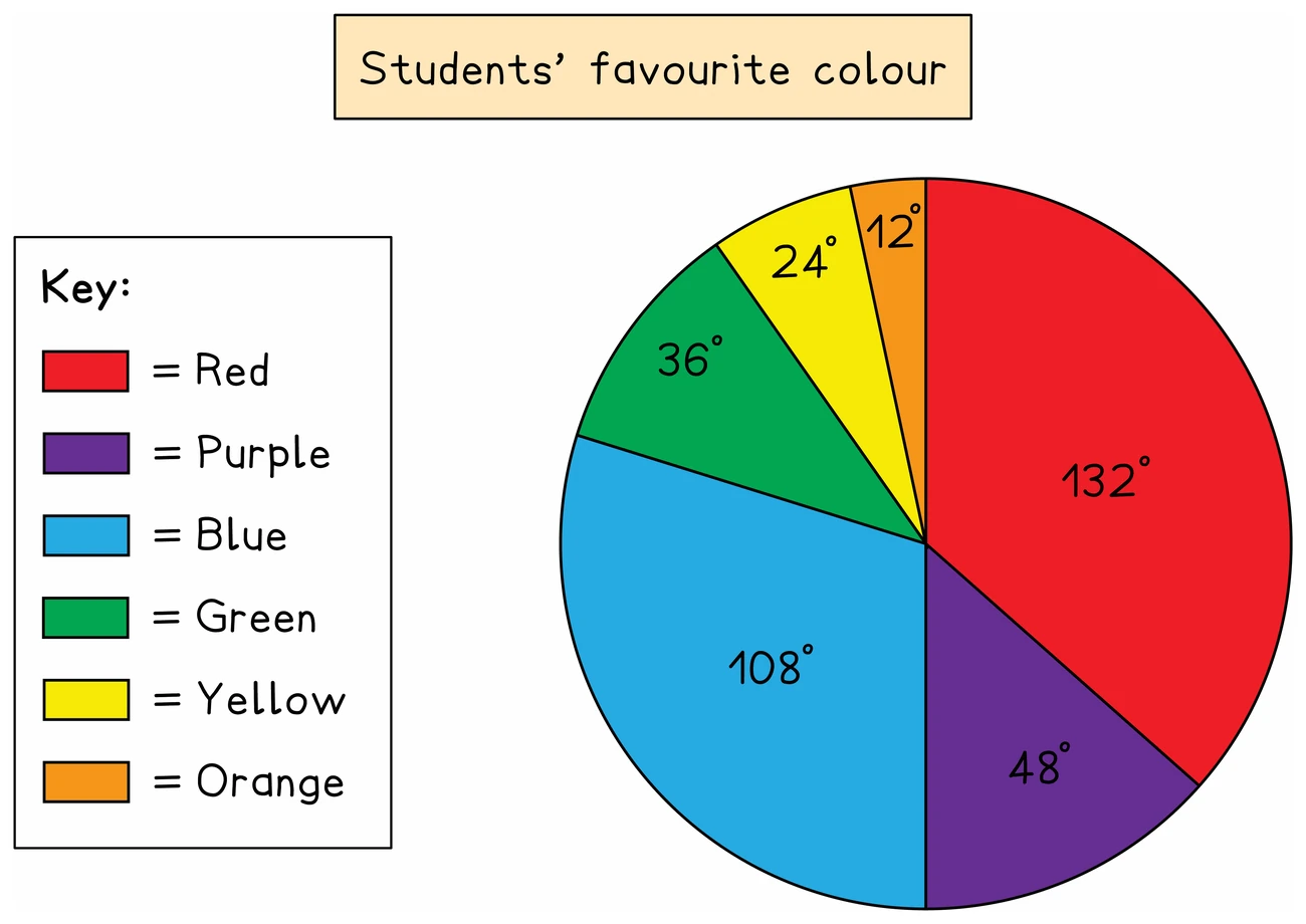
Reading one
- Going the other way, frequency = (angle ÷ 360°) × total frequency
- A sector's angle alone cannot give a frequency without the total, which is why, when two pie charts show different totals, a larger sector does not have to mean a larger frequency
Worked example
Calculating pie chart angles
Forty people are asked their favourite drink. The table shows the results. Work out the angle of each sector for a pie chart.
| Favourite drink | Tea | Coffee | Juice | Water |
|---|---|---|---|---|
| Number of people | 14 | 12 | 9 | 5 |
Solution:
- Each angle is the category's share of 360°
- With 40 people, one person's share is 360 ÷ 40 = 9°, which is the same as working out frequency ÷ 40 × 360 for each drink but needs no calculator
- Tea: 14 × 9 = 126°
- Coffee: 12 × 9 = 108°
- Juice: 9 × 9 = 81°
- Water: 5 × 9 = 45°
- Check: 126 + 108 + 81 + 45 = 360