MathematicsExam code: 0580
Statistical Diagrams
Statistics
Drawing conclusions properly
- Comparing two data sets needs both an average and a measure of spread, and a comparison using only one of them is incomplete
- Say what the comparison means in the context of the question rather than only quoting numbers
- The syllabus asks you to appreciate the restrictions on what data can show
- A small sample may not represent the whole population
- A diagram showing proportions, such as a pie chart, hides the actual totals
- A correlation between two things does not establish that one causes the other
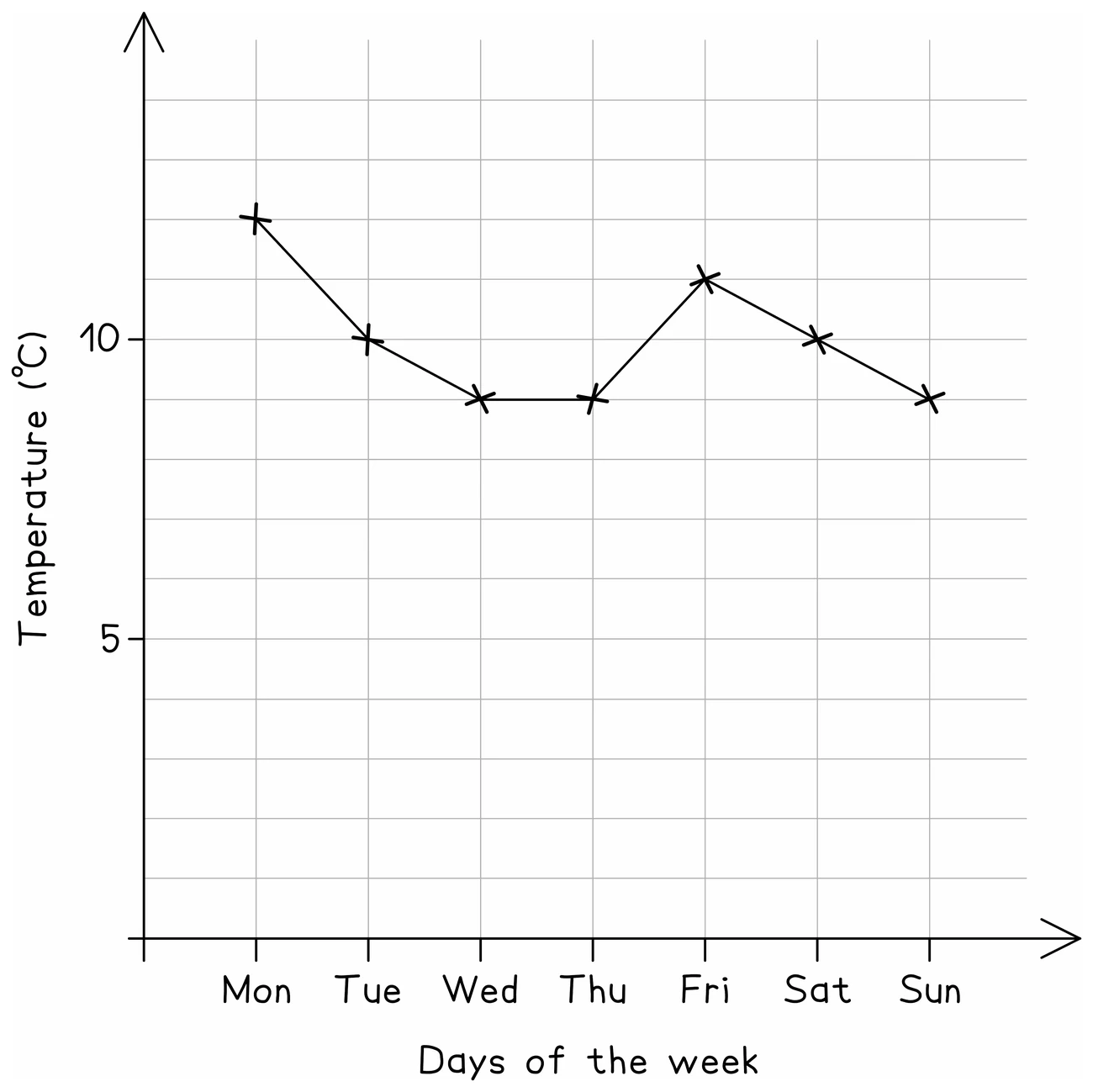
- Check the scale on any printed diagram before reading values, since axes do not always start at zero
Worked example
Comparing two sets properly
Class A has median 62 marks and range 30. Class B has median 55 marks and range 12. Compare the two classes.
Solution:
- A comparison needs one statement about average and one about spread, each interpreted in context
- The medians: 62 is higher than 55
- In context: on average, Class A scored higher marks than Class B
- The ranges: 30 is larger than 12
- In context: Class B's marks were more consistent, because a smaller range means the marks were closer together
- Writing only "A's median is 62 and B's is 55" lists the numbers without comparing them: say which is higher, name the measure, and say what it means for the two classes