Scatter Graphs and Correlation
Statistics
Drawing one
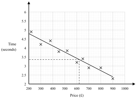
- Once a diagram has been seen to slope one way or the other, its trend can be summarised by a line of best fit
- The syllabus is precise about what it must look like
- A single ruled straight line, drawn by inspection with a ruler
- It must extend across the full data set, not just the middle
- It need not pass through any of the points, but the points should be roughly evenly distributed on either side along its whole length
- Where one point clearly sits away from the pattern, an outlier, ignore it when placing the line
- Never draw a curve, and never join the points
Using one
- The line lets you estimate one quantity from the other: go from the known value straight to the line, then turn and read the other axis (up then across from the horizontal axis, across then down from the vertical axis)
- Estimating within the range of the data is interpolation, and it is reasonably reliable
- Estimating beyond the data is extrapolation, and it is unreliable because the trend may not continue
- If a question asks whether an estimate is reliable, check whether the value lies inside the plotted range: outside it, the estimate is unreliable
Exam tip
Read the estimate from your own line
Rule your line first, then take the estimate from that line, not from the table or the nearest cross: draw a line from the given value to your line, then turn to the other axis. The estimate mark follows through from your own line, but the schemes tie it to a straight line sloping the same way as the points, so a curve or a zigzag joining the crosses loses it along with the mark for the line.
Worked example
Reading an estimate from a line of best fit
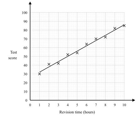
A scatter diagram plots revision time in hours against test score for students who revised for between 1 and 10 hours. The line of best fit passes through (2, 38) and (8, 74). Estimate the score for a student who revises for 5 hours, and interpret the gradient.
Solution:
- The line rises from 38 to 74 as the hours go from 2 to 8
- Change in score = 74 − 38 = 36, over a change of 8 − 2 = 6 hours
- Gradient = 36 ÷ 6 = 6
- Five hours is 3 hours beyond (2, 38), so the score rises by 3 × 6 = 18
- Estimated score = 38 + 18 = 56
- On the diagram itself, the same estimate comes from going up from 5 on the hours axis to the line, then across to the score axis
- The gradient means that each extra hour of revision is associated with about 6 more marks
- Five hours lies inside the plotted range, so this is interpolation and reasonably reliable